 |
| Juicy Watermelon |
Thursday, June 2, 2011
Lourdes Hallway Plan Challenge

Thursday, May 19, 2011
Pig Art


When making my pig art, I tried to think of a concept that had little to do with a common picture of a pig. I felt that something unusual may be a good idea to attract the public. I wanted the pig to stand out so I turned my picture into black and white to make the colour of the pig strike the viewer. I got my dad to pose in a picture of him holding a random picture. Once I uploaded the picture, I erased the picture he was holding entirely, and added in a black picture frame. I copied the picture multiple times and made sure that his hands were cut out of each picture so that they were visible. In order for my picture to be believable, I made sure that it was an outdoor setting so that the pig fits in with his surroundings.
Thursday, May 12, 2011


Tuesday, May 3, 2011
CD Cover Assignment- KO
 |
| CD Cover #1 |
 |
| CD Cover #2 |
 | ||||||||
| CD Cover #3 |
When designing my CD cover for KO, I wanted it to represent where he comes from as an artist and how give it a "laid back" feel like his music he produces. For the CD cover #1 this was my design with the most technical aspects in it. I made it look as though he is singing to the city of Toronto, and the skyline is one of the main focal points. I decided to have a clear picture of him standing in the front so that you are able to easily recognize who the CD cover is for. The smoke in the background unites the city and KO as it appears as the sky along with part of the stage that he is preforming on. In the CD cover #2, I decided to just remove some of the elements from the first cover to make it simpler. In this one you are able to see the lights of the city more, and you really can focus on the shadow of KO in the sky. In both the first and second cover, i made sure that the same tone of red was used throughout to match his logo. In the CD cover #3, I wanted to make something totally different than the others. I used a close up picture of his face so that you can see him as a performer. I like how it is black and white so the KO label really sticks out. I made sure that all of my covers were somewhat simple as his music isn't too crazy and upbeat. Even though I was only supposed to do ONE picture, I had fun doing it and wanted to do more.
Friday, April 29, 2011
 |
| Tyiptych #1 |


When creating my Photography Triptychs, I went into my backyard to find some interesting pictures of nature. For my first Triptych, I used three pictures of different textures of wood that had interesting pattern. Overall I feel as though when you zoom in on each of these pictures, the grains and looks of each are very unique but also are compatible with each other. The picture on the left, is a picture of the side of a very old shed turned vertically. I changed the colours of this picture by adjusting the hue and saturation of the picture. In this picture you can really see how old looking this wood is by it's aged look and deep lines. The middle picture is a zoomed in picture of some old wooden steps with some leaves scattered on top. For this picture, I also enhanced the colours to make it similar to the first picture. The picture on the right, is of the bark of a big oak tree. The light that is captured in this picture adds interest to the dimensions of the tree and creates a focal point. All three of these pictures have the same sort of style, although each is different in their own way. I made sure that in each picture that there was a certain tone of pink that can be seen in each. This is what unites these three pictures onto one Triptych.
 |
| Triptych #2 |


In my second Triptych, I chose three pictures that are similar based on the natural colours that are in them. All of these pictures are also of different woods in my backyard. Each of these pictures have a very unique look to each of them. The top left one is a picture of a log of wood with a pattern of holes in it. The bottom picture is of a pile of swigs. This picture has a interesting look to it because there are so many sticks over lapping each other. The big picture on the right, is a zoomed in image of a tree with sap running down the side. This triptych has a sense of gore to it, as the red tones are brought out using the colour enhancing tool.
Thursday, April 21, 2011
Guelph Multicultural Festival Poster

I think that my poster contains many of the aspects of the City of Guelph and of our world. The large peace sign of the map, expresses how our planet needs to unite in a peaceful order and all become one. The theme of this festival was the inspiration for my picture as I filled in the peace sign with the moon and sun representing how we all require the same necessities for life. I filled it also with butterflies to represent how we all live and change as we grow. I added the leaves into it, because the planet needs to be looked after in order to take care of us in return. And I also added in bright colourful flowers to represent how we are all diverse and unique, but are united as we are all equal. I feel that my poster is bright and eye catching, yet simple and easy to understand. The titles stand out well with the white and black contrast so that the message may be communicated clearly.
Tuesday, April 12, 2011
Photojournalism Assignment
PART ONE:
Photojournalism needs to have a sense of ethical behavior that gets portrayed in the photography that is being taken. Since it is a common occurrence that photos in journalism capture a story about a certain person or groups of people, it is needed that dignity for the individual is present. Everyone has the right to say wether or not they want a certain picture being seen by the public or not, but sometimes this right is ignored by journalists or paparazzi. The rules that journalists should follow are to respects ones personal space, and to ask permission before capturing a picture of a specific person. Along with respecting the people that they are photographing, they also need to consider how they would feel if something personal in their life was exposed to the public at the level in which they journal. Having a code of ethics is necessary because journalism would become so extreme that no one would have any privacy or personal life. As every story may become more and more demeaning, journalists would try to outdo each other and therefore putting the security of people lives in jeopardy.
PART TWO:
 I chose this picture that I took because I thought that it displayed how committed and enthusiastic this speaker was. Although his face is hidden from this picture, you still can see on the audiences faces that they are enjoying what he is saying and having a good time. You can easily tell that Keith is interacting with the viewers by the fact that he is standing on a chair trying to attain their attention while make a important point. This picture shows a large amount of the crowd to show how popular this speaker was.


Photojournalism needs to have a sense of ethical behavior that gets portrayed in the photography that is being taken. Since it is a common occurrence that photos in journalism capture a story about a certain person or groups of people, it is needed that dignity for the individual is present. Everyone has the right to say wether or not they want a certain picture being seen by the public or not, but sometimes this right is ignored by journalists or paparazzi. The rules that journalists should follow are to respects ones personal space, and to ask permission before capturing a picture of a specific person. Along with respecting the people that they are photographing, they also need to consider how they would feel if something personal in their life was exposed to the public at the level in which they journal. Having a code of ethics is necessary because journalism would become so extreme that no one would have any privacy or personal life. As every story may become more and more demeaning, journalists would try to outdo each other and therefore putting the security of people lives in jeopardy.
PART TWO:

photo #1

photo #2
My second picture that I chose to put up on my blog is the one with the most clear and expressive emotion on his face. Keith brought up a student from the audience to involve him into his presentation. Although the student does not seem to be very impressed with the situation, the speaker helped to make him feel more comfortable by asking questions. You can also see in the picture, that he is listing points and really talking into the audience.

extra photo #3
Thursday, April 7, 2011
I chose to make my "Vote" poster look as if it would be painted onto a city wall downtown somewhere. I felt that this idea would attract the eyes of teenagers because it is bright and artistic looking. Since it is important for teenagers to learn that voting for their government is a crucial part of being a citizen of Canada, I thought that a poster that can relate to the youth would be a good idea. Although graffiti can sometimes be considered destructive to public property, it can also be recognized as a beautiful form of art with lots of character. I think that through this poster, many people will be influenced to vote at our school election.
Friday, April 1, 2011
Poetry Cover

"Butterfly Dreaming"
For this Poetry Cover assignment, I knew that I wanted to make a cover that had a "Spring" feel to it. With the butterflies, green grass and blue skies, it is the definition of a fresh and bright day. First, I found a beautiful sketch of a butterfly that I filled with colour and black outline with the paint tool. I made the butterfly look like a rainbow with colours that flowed well together. The next thing that I did, was to add a poetry aspect to the picture by putting in the notpad and making it appear that the butterfly is being written on the paper.
NOT DONE
NOT DONE
Friday, March 11, 2011
Portrait Pictures
 |
| Photo #1 Colour Picture |
 |
| Photo#2 Colour/BW |
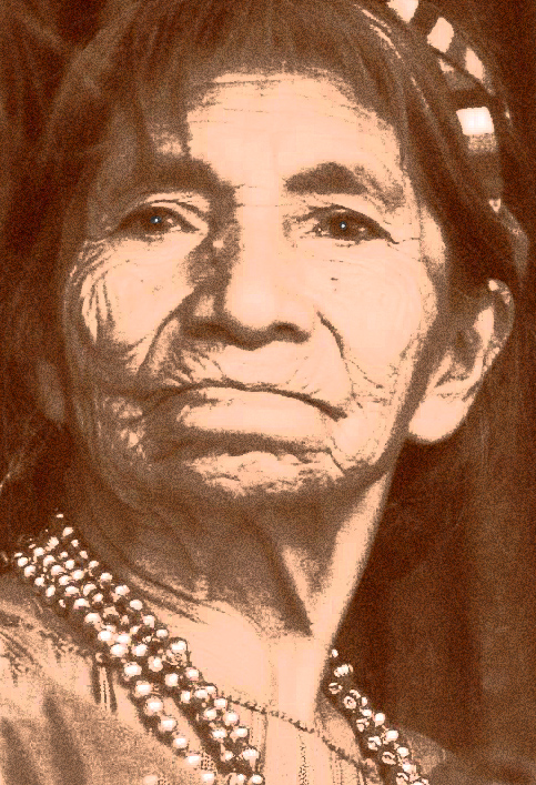 |
| Photo#3 Sepia |
Photo #1: In my first picture, there is a young girl from Guatemala captured at an angle. This is my colour picture because of the bright colours that she is wearing as her authentic outfit. She is leaning up against her dad and from her smile, it looks as if she is looking at somthing that she finds familiar and comforting. From the angle that she is turned, you can really see the ribbons that are wrapped in her hair and the stripes of her dress. For the background, I used the magic wand tool and cut out around the image of the girl. I found a picture with swirls and bright colours to use in behind of the picture. The swirls are placed in a way that they outline and flow around the little girls face. I also adjusted the colours of the entire photo to bring out the darker blue hues of her outfit.
Photo#2: In my second picture, I used a combination of both black and white, and colour to emphasize on the little girls face. The way that her face is looking up into the sky really adds the right amount of emotion. By capturing her slight smile and her messy hair makes it seem that she is in trouble looking up to the sky for some kind of relief. In the background, I added a colourful garden of sunflowers and bright purple clouds. It makes it appear that she is in a friendly and sunny place. I also added a lens flare to the top right corner to lead her eyes up to something. It looks like she is glancing up to either a sun or heaven, which gives this picture an overall peaceful feel.
Photo#3: This picture is a portrait of an elderly woman from Guatemala with lots of wrinkles and interesting attributes. It is a very intimate photo because it is so close up that you can see every detail of her face. The fact that this picture is in sepia, makes it feel warm without adding any real colour. By altering the lighting, it brings out her facial features and really shows the wether in her face. I decided to keep her jewelry in the picture, so that you are not just looking at her face, but also the other elements that make this picture so unique. I whitened the pupils of her eyes to make her emotion more striking. It appears as if she has lived a hard life but still is appreciative with what she has. Overall, I think the amount of texture and detail within this photo makes is very striking and artistic.
Thursday, February 17, 2011

not finished :)
Friday, February 11, 2011
 |
| original foreground tree photograph |
 |
| original sunset photograph |
 |
| original water and sky reflection photograph |
 |
| original tree line photograph |
 |
| "A Fisherman's Dream" final project picture with the foreground grained |
 |
| "A Fisherman's Dream" final project picture with background grained |
When getting this landscape project assigned to me, I immediately pictured a peaceful scene with water, trees and either a sunset or sunrise. I found inspiration by looking at pictures of lakes, beaches and trees to combine my thoughts into one. Once I had a number of pictures saved, I went through them all and picked out my favorites. I ended up using four main images that seemed to be easy to combine. The first step that I took was to set up the background forest and the sky. To make my picture seem to be distant and somewhat foggy, I cut out the trees and erased the edges to blend them well into the sky. The one part that was difficult, was when I had to hide the dark ships that were included in the sky picture that I was using. After filling in the space that they left, I was able to focus on the sky. As I recently learned, you can adjust the hue and saturation to make the sky change its colour from the original photograph. This procedure made it possible for me to control the colours that I incorporated into my piece. Since there was such a large gap in between the two sides of the forest, I thought that it would be a perfect place to put in a sun. I found this brilliant orange sun from a different picture that went well with the orange in the reflection of the water. This step was very frustrating because I had to ensure that the sky, water and sun all blended together. Without a doubt, the most time consuming part of my project was when I had to cut out the foreground tree.
Since I wanted to make it look as though you were looking through trees to the background where the water and sky is, I had to specifically cut around all of the tree and grass (with the magic wand tool ) so that colour was able to show through the leaves. During this process I realized that where the grass ended, and where the water began, there was a large space that I needed to fill. Once I contemplated a few options, I decided that the best thing to do was to just use the paint tool and fill in the water myself. After finishing all of these steps, I felt as though my picture was missing a specific focal point. That is why I decided to place a canoeist into the middle of the lake. This added an overall reason for the lake and scenery. It really brought together the many peaceful aspects into one picture.
Now that I am finally finished working on this project, I am able to look at it and decide if I truly enjoy my work and if I correctly enterpreted the right feel that I was aiming for. I really admire the colours that I based the picture around and how the entire image represents a peacful and beautiful atmosphere. The very last change that I made to my picture, was to add some texture to create some depth and contrast between the forground and background. I felt that by adding grain (in one of the pictures) to the water and sky areas, it was creating a foggy aspect where the black tree in front, was very clear while the backgound feels far away. In my second version of my final picture, I switched the technique around so that I have the backfound crisp and clear, while the black tree seems to blurring and non distict. personally I prefere the the picture where the water and sky are grained becuase it emphasises the fact that it is a sunset image where everything is blurred together.
Tuesday, February 8, 2011
question #2
Yes I do agree to uphold the rules in this lab and to listen to you Mrs. Reidel. I will try my best to hand projects in on time and I promise that I will not affect my computer with viruses.
Monday, February 7, 2011
question #1
I am very excited to be able to experiment with different elements of designs and learn more about Photoshop. Last year when I was introduced to the program, I felt as though I did not use it to its' full potential. Since this is my last year at high school, I would love to gain as much knowledge in the field of design as I possibly can.
Subscribe to:
Comments (Atom)