 |
| Juicy Watermelon |
Thursday, June 2, 2011
Lourdes Hallway Plan Challenge

Thursday, May 19, 2011
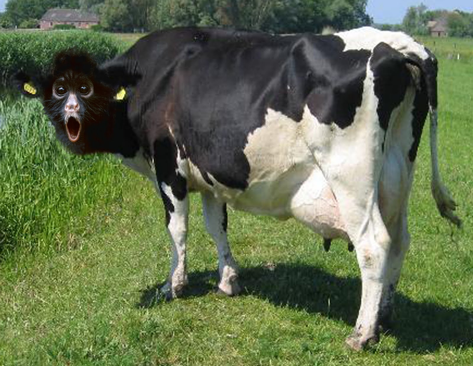
Pig Art


When making my pig art, I tried to think of a concept that had little to do with a common picture of a pig. I felt that something unusual may be a good idea to attract the public. I wanted the pig to stand out so I turned my picture into black and white to make the colour of the pig strike the viewer. I got my dad to pose in a picture of him holding a random picture. Once I uploaded the picture, I erased the picture he was holding entirely, and added in a black picture frame. I copied the picture multiple times and made sure that his hands were cut out of each picture so that they were visible. In order for my picture to be believable, I made sure that it was an outdoor setting so that the pig fits in with his surroundings.
Thursday, May 12, 2011


Tuesday, May 3, 2011
CD Cover Assignment- KO
 |
| CD Cover #1 |
 |
| CD Cover #2 |
 | ||||||||
| CD Cover #3 |
When designing my CD cover for KO, I wanted it to represent where he comes from as an artist and how give it a "laid back" feel like his music he produces. For the CD cover #1 this was my design with the most technical aspects in it. I made it look as though he is singing to the city of Toronto, and the skyline is one of the main focal points. I decided to have a clear picture of him standing in the front so that you are able to easily recognize who the CD cover is for. The smoke in the background unites the city and KO as it appears as the sky along with part of the stage that he is preforming on. In the CD cover #2, I decided to just remove some of the elements from the first cover to make it simpler. In this one you are able to see the lights of the city more, and you really can focus on the shadow of KO in the sky. In both the first and second cover, i made sure that the same tone of red was used throughout to match his logo. In the CD cover #3, I wanted to make something totally different than the others. I used a close up picture of his face so that you can see him as a performer. I like how it is black and white so the KO label really sticks out. I made sure that all of my covers were somewhat simple as his music isn't too crazy and upbeat. Even though I was only supposed to do ONE picture, I had fun doing it and wanted to do more.
Friday, April 29, 2011
 |
| Tyiptych #1 |


When creating my Photography Triptychs, I went into my backyard to find some interesting pictures of nature. For my first Triptych, I used three pictures of different textures of wood that had interesting pattern. Overall I feel as though when you zoom in on each of these pictures, the grains and looks of each are very unique but also are compatible with each other. The picture on the left, is a picture of the side of a very old shed turned vertically. I changed the colours of this picture by adjusting the hue and saturation of the picture. In this picture you can really see how old looking this wood is by it's aged look and deep lines. The middle picture is a zoomed in picture of some old wooden steps with some leaves scattered on top. For this picture, I also enhanced the colours to make it similar to the first picture. The picture on the right, is of the bark of a big oak tree. The light that is captured in this picture adds interest to the dimensions of the tree and creates a focal point. All three of these pictures have the same sort of style, although each is different in their own way. I made sure that in each picture that there was a certain tone of pink that can be seen in each. This is what unites these three pictures onto one Triptych.
 |
| Triptych #2 |


In my second Triptych, I chose three pictures that are similar based on the natural colours that are in them. All of these pictures are also of different woods in my backyard. Each of these pictures have a very unique look to each of them. The top left one is a picture of a log of wood with a pattern of holes in it. The bottom picture is of a pile of swigs. This picture has a interesting look to it because there are so many sticks over lapping each other. The big picture on the right, is a zoomed in image of a tree with sap running down the side. This triptych has a sense of gore to it, as the red tones are brought out using the colour enhancing tool.
Thursday, April 21, 2011
Guelph Multicultural Festival Poster

I think that my poster contains many of the aspects of the City of Guelph and of our world. The large peace sign of the map, expresses how our planet needs to unite in a peaceful order and all become one. The theme of this festival was the inspiration for my picture as I filled in the peace sign with the moon and sun representing how we all require the same necessities for life. I filled it also with butterflies to represent how we all live and change as we grow. I added the leaves into it, because the planet needs to be looked after in order to take care of us in return. And I also added in bright colourful flowers to represent how we are all diverse and unique, but are united as we are all equal. I feel that my poster is bright and eye catching, yet simple and easy to understand. The titles stand out well with the white and black contrast so that the message may be communicated clearly.
Subscribe to:
Comments (Atom)