Thursday, May 19, 2011
Pig Art
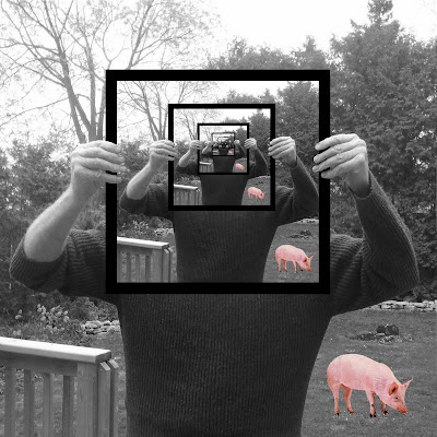
When making my pig art, I tried to think of a concept that had little to do with a common picture of a pig. I felt that something unusual may be a good idea to attract the public. I wanted the pig to stand out so I turned my picture into black and white to make the colour of the pig strike the viewer. I got my dad to pose in a picture of him holding a random picture. Once I uploaded the picture, I erased the picture he was holding entirely, and added in a black picture frame. I copied the picture multiple times and made sure that his hands were cut out of each picture so that they were visible. In order for my picture to be believable, I made sure that it was an outdoor setting so that the pig fits in with his surroundings.
Tuesday, May 3, 2011
CD Cover Assignment- KO
 |
| CD Cover #1 |
 |
| CD Cover #2 |
 | ||||||||
| CD Cover #3 |
When designing my CD cover for KO, I wanted it to represent where he comes from as an artist and how give it a "laid back" feel like his music he produces. For the CD cover #1 this was my design with the most technical aspects in it. I made it look as though he is singing to the city of Toronto, and the skyline is one of the main focal points. I decided to have a clear picture of him standing in the front so that you are able to easily recognize who the CD cover is for. The smoke in the background unites the city and KO as it appears as the sky along with part of the stage that he is preforming on. In the CD cover #2, I decided to just remove some of the elements from the first cover to make it simpler. In this one you are able to see the lights of the city more, and you really can focus on the shadow of KO in the sky. In both the first and second cover, i made sure that the same tone of red was used throughout to match his logo. In the CD cover #3, I wanted to make something totally different than the others. I used a close up picture of his face so that you can see him as a performer. I like how it is black and white so the KO label really sticks out. I made sure that all of my covers were somewhat simple as his music isn't too crazy and upbeat. Even though I was only supposed to do ONE picture, I had fun doing it and wanted to do more.
Subscribe to:
Comments (Atom)


